Andy Warhol’s Top 10 Paintings
Fondly referred to as the ‘Pope of pop art’, Andy Warhol was responsible for many of the most famous works in art history. Coming to prominence in the 1960s, he focused on distinctly American objects, advertisements and celebrities, producing work in mediums including silk-screening, photography, film and sculpture. Some of his creations are among the most expensive artwork ever sold, and in this piece, we’ll be looking at Andy Warhol’s top 10 paintings.
1. Marilyn Diptych (1962)
Widely considered one of his best paintings, Warhol created the 1962 Marilyn Diptych in tribute to the late Marilyn Monroe who died after overdosing on barbiturates that same year. Comprising 50 different takes on the actress’s publicity photograph for her movie Niagara, the left side of the painting is in color, while the right is in an intentionally blurry black and white.
Marilyn Diptych fuses two of Warhol’s most consistent themes: death, and the cult of celebrity. The repetition of the image of Monroe represents her ubiquitous media presence, with the contrast of vivid colours with black and white evocative of her mortality. The painting has been praised for encapsulating Monroe’s legacy, and was ranked as the third most influential piece of modern art by The Guardian. Warhol ended up creating a number of individual versions of the same image, and we offer many Warhol Marilyn prints for sale here at ArtLife.
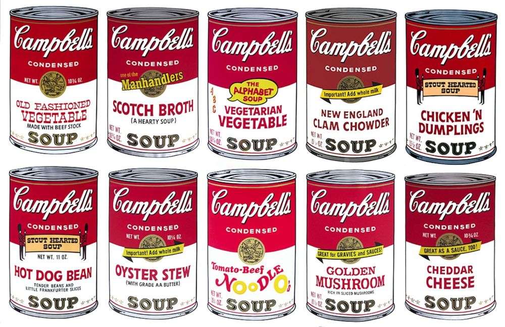
2. Campbell’s Soup Cans (1962)
Warhol often appropriated familiar images from consumer culture in his work, and his Campbell’s Soup Cans painting is perhaps the most famous example of this. The original series was made up of 32 canvases, with each depicting a different variety of soup offered by the company at the time. When Warhol first exhibited the piece in 1962, the canvases were displayed together on shelves like products in a grocery aisle. Each one is hand-painted, with a hand-stamped fleur-de-lys pattern on the bottom edge of the cans.
The Campbell’s Soup Cans series resembles the mass-produced printed advertisements of the era, and Warhol chose this particular product due to his passion for painting ordinary things, and his fondness of the soup itself. The painting was later sold to the Museum of Modern Art for upwards of $15 million after Warhol’s death. Warhol went on to produce a huge variety of works depicting Campbell’s soup cans during his life, many of which are available from us.
3. Cow Series (1966)
While Warhol himself wasn’t initially interested in cows, he decided to incorporate them into his work when art dealer Ivan Karp said to him: “Why don’t you paint some cows, they’re so wonderfully pastoral and such a durable image in the history of the arts.” And so it transpired, with Warhol finishing the initial Cow Wallpaper in 1966, adding more to the series throughout the 70s.
Each Cows screenprint consists of vividly colored cows against a background of contrasting colors, with the image used chosen by Warhol’s in-house printer Gerard Malanga. The series had four color schemes: Pink Cow on Yellow Background(1966), Brown Cow with Blue Background(1971), Yellow Cow on Blue Background(1971) and finally Pink Cow on Purple Background(1976).
4. Mao (1973)
Warhol created his Mao paintings in 1973 in response to US president Richard Nixon’s meeting with the Chinese leader the year before. This event ended decades of diplomatic tension between the two countries and captured the artist’s imagination, prompting him to design hundreds of canvases of Mao — some as large as 15 ft x 10 ft.
However, this painting certainly isn’t a celebration of Mao, with the graffiti-like splashes of color and blue eyeshadow actually defacing his image. Indeed, many critics believe this reflects the freedom of self-expression available to artists in the West, in stark contrast to the communist propaganda the original image represented.
5. Dollar Sign (1981)
Arguably, no painting reflects mass identity, opulence and affluence like Warhol’s almighty Dollar Sign. Intrigued throughout his life by glitz and glamour, the painting represents the intersection between wealth and art, with both considered luxury commodities in their own right. The painting was made using acrylic and silkscreen ink on canvas, and repeats the American dollar sign in bright neon colors. Warhol drew the source image for the series by hand himself, as he couldn’t find one elsewhere which he considered dramatic-looking enough.
6. The Flower Series (1964)
A significant departure from Warhol’s usual themes of celebrity and consumerism, the Flowers series was inspired by photographs taken by Patricia Caulfield, published in 1964. Warhol experimented with different colors for the flowers, from vibrant pink and orange in one print to all white in another. In some prints, he departs from the original template entirely, producing shadows of multiple flowers. Caulfield actually went on to file a lawsuit against Warhol for the unauthorized use of her image, which is almost comical when you consider how many years he spent replicating copyrighted product labels. The case was eventually settled out of court.
7. Camouflage Series (1986)
Warhol’s Camouflage series was released a few months before his death in 1987, making it his last ever print portfolio. The inspiration was provided by his studio assistant Jay Shriver, who was experimenting with pushing paint through military cloth. Camouflage may have appealed to Warhol’s obsession with brands and logos, while the representational pattern also spoke to his interest in Abstract Expressionist art.
Warhol merged this imagery with psychedelic colors to fundamentally alter the concept of camouflage as a disguise, and its utilitarian and military connotations. In its intended form, Camouflage was only exhibited once, at a group show in New York in 1986, and is now on display in the ARTIST ROOMS at National Galleries of Scotland, a touring programme in collaboration with Tate.
8. Banana (1967)
As well as being the manager of rock band The Velvet Underground, Warhol also painted the cover of their debut album, The Velvet Underground & Nico. The banana that featured on early editions was accompanied by the words “Peel Slowly and See” and covered by a banana skin sticker that viewers could pull back to reveal a flesh-colored fruit underneath — an intentionally phallic image. The album cover became one of the most iconic of all time, and those early versions (with the sticker intact) are now rare collector’s items. Speaking about the legacy of the image, the band’s lead singer Lou Reed has said: “Members of the public, particularly those who listen to rock music, immediately recognize the banana design as the symbol of The Velvet Underground.”
9. Gun (1982)
Death became a prominent theme in Warhol’s art throughout the 1960s, and his fears intensified from 1968 when he was shot and almost killed by feminist writer Valerie Solanas at his studio, the Factory. Though he survived, he was forced to wear a surgical corset for the rest of his life after bullets tore through his stomach, liver, spleen, esophagus and both lungs.
It is likely that the shooting inspired Warhol’s Gun paintings, which were released almost 13 years after the assault. Depicting a weapon similar to the .22 snub-nosed pistol Solanas used in her assassination attempt, the absence of a subject only heightens the gun’s status as an ambivalent symbol, equally exalted, reviled and sanitized in mass media and popular culture.
10. Green Coca-cola Bottles (1962)
Portraying one hundred and twelve almost identical Coca-Cola bottles, Warhol believed the universal popularity of the soft drink carried a very positive message .“What’s grand about this country is that America started the tradition where the richest consumers buy essentially the same thing as the poorest…” he wrote in his 1975 book
The Philosophy of Andy Warhol. “You can know that the President drinks Coke, Liz Taylor drinks Coke, and, just think, you can drink Coke, too. A Coke is a Coke, and no amount of money can get you a better Coke.”
Created the same year in which Warhol began developing his pioneering silkscreen technique, the image of a single Coca-Cola bottle is replicated in regular rows above the company logo. It is believed to resemble an advertising poster, which evoked Warhol’s love of consumerism.